
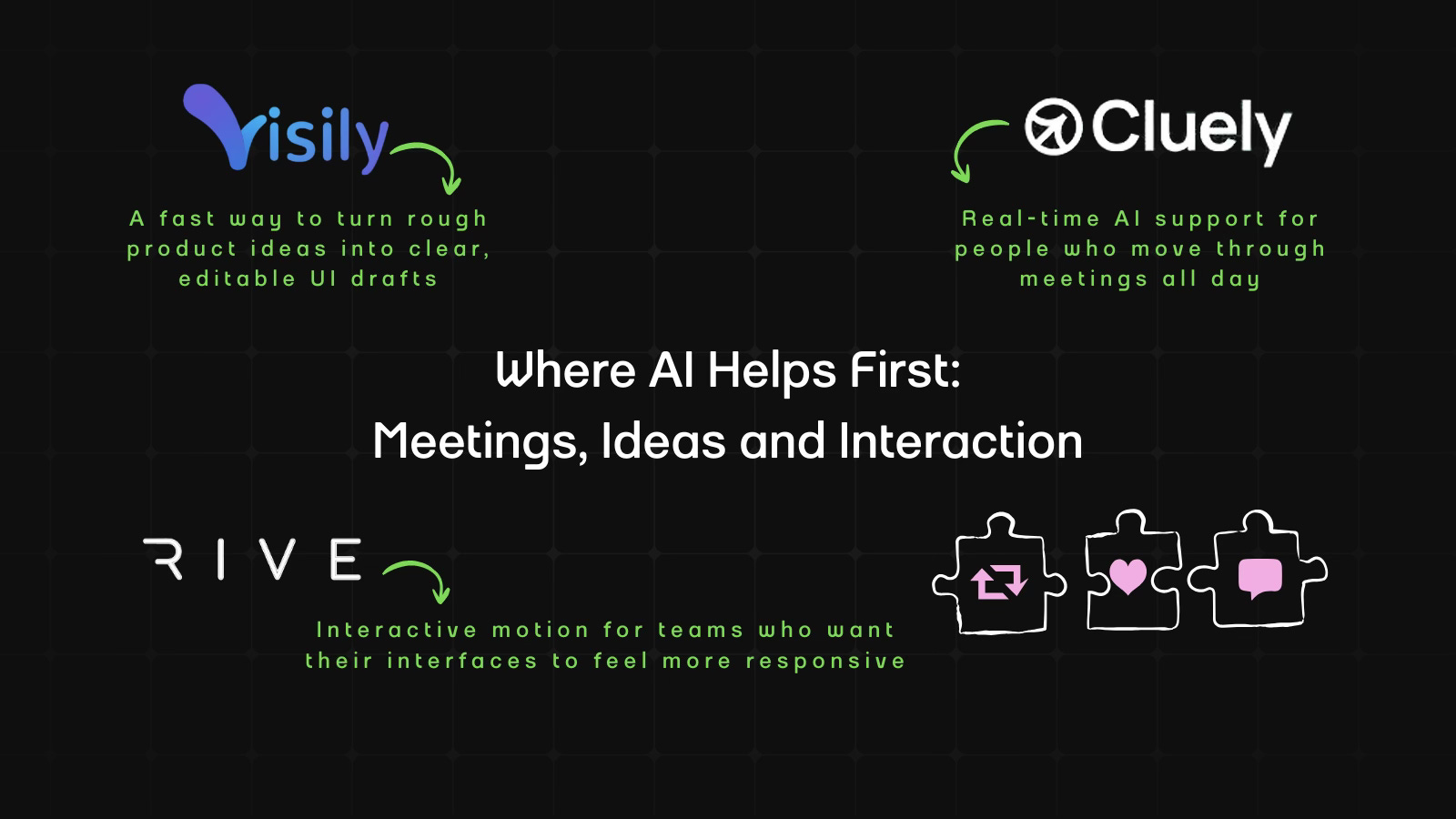
Where AI Helps First: Meetings, Ideas and Interaction
Cluely, Visily and Rive lead this week’s issue with practical ways to make early-stage work easier, from meeting clarity to first UI drafts to motion design.

Welcome to AI Fyndings!
With AI, every decision is a trade-off: speed or quality, scale or control, creativity or consistency. AI Fyndings discusses what those choices mean for business, product, and design.
In Business, Cluely rethinks how real-time support shows up inside meetings.
In Product, Visily brings structure to early ideas before design even begins.
In Design, Rive shows how motion can respond to users instead of playing on repeat.

AI in Business
TL;DR
Cluely is a live meeting assistant that listens, captures your screen, and notes conversations as they happen. What I found useful is that it works well for anyone who needs to take back-to-back calls or even students who need quick clarity without multi-tasking.
Basic details
Pricing: Free plan available; Pro plans start at $20 per month
Availability: Browser-based
Best for: Students, sales teams, professionals
Use cases: Meeting notes, summaries, and follow-up emails
Most meeting tools help you only after the call ends. Cluely comes from a very different starting point. Its earliest version was built by students who noticed how difficult it is to think, listen and take notes all at once during high-pressure situations like job interviews. That early experiment caused controversy, but it led to a simple insight: people often need help during the meeting, not after they’ve already forgotten half of it.
Cluely is built around that idea. Instead of being a passive recorder, it tries to support you while the meeting is happening. It listens, watches your screen and tries to keep up with the mess in real time. It exists for the exact moments you won’t admit out loud, like when you are presenting and missing half of what people say, or when you zone out for thirty seconds and return to a discussion that has somehow moved ahead four chapters without you. Cluely helps you circle back to the plot without asking you to confess that you lost midway.
It also cuts out the emotional work of pretending you can keep up with everything. Normally you are multitasking your way into a headache. Cluely takes some of that pressure off so the meeting or lesson feel less like a survival test.
What’s interesting
Cluely’s most interesting quality is how active it is while you are in the call. You see a running transcript in real time, with a claimed 300 millisecond response time. It supports more than 12 languages, including English, Chinese and Spanish, which is great for global teams and also for that one coworker or speaker who switches languages mid sentence like they are changing TV channels.
Alongside the transcript, Cluely lets you ask questions at any moment such as “What should I say?”, “What’s the summary so far?” or “Give me follow-up questions.” You can even trigger help instantly with keyboard shortcuts, which feels natural once you get used to it.
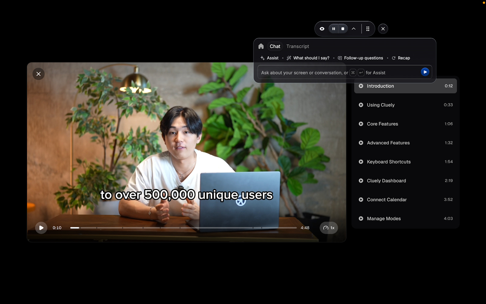
The tool also picks up on whatever you’re showing on screen. Slides, documents, resumes, scripts or briefs you upload into a mode become reference points during the call. As you talk, Cluely helps surface what’s relevant so you don’t break focus.
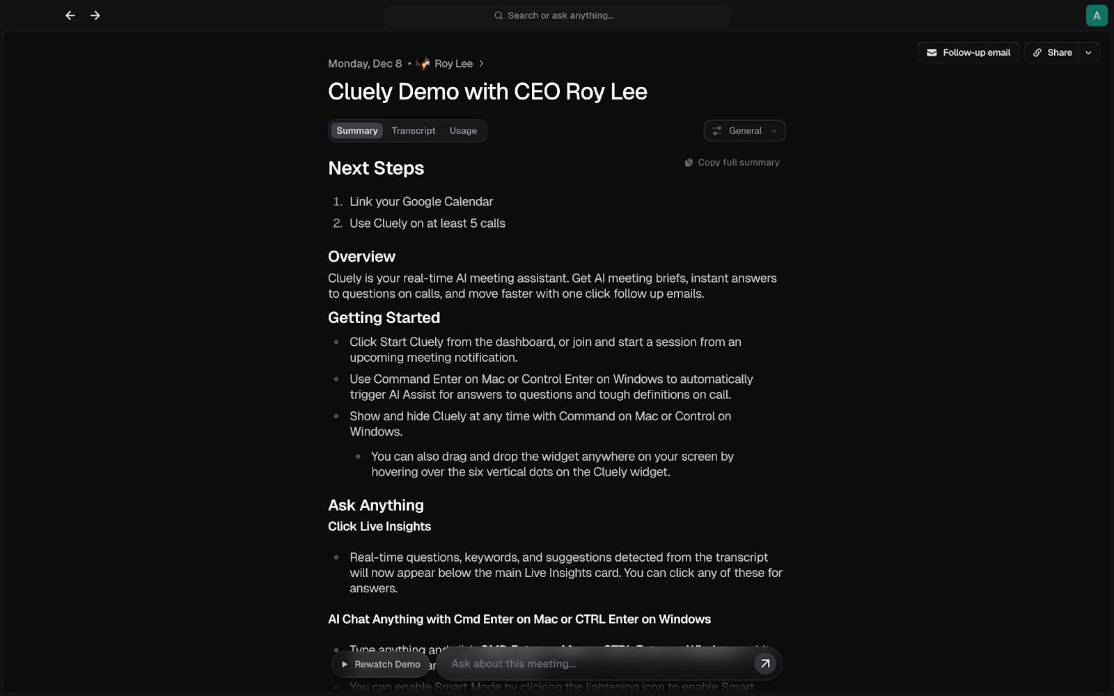
Once the meeting ends, everything comes together quickly. You get a summary, action items, suggested next steps, a drafted follow-up email and a complete transcript you can chat with for clarity, and all of this can flow into tools you already use, like Slack, HubSpot, Salesforce or Notion. The turnaround time makes it feel like a companion that stays one step ahead.
Where it works well
Cluely works best in meetings that move quickly or jump between different topics. If you’re presenting, switching tabs or walking someone through a document, it keeps track of the important parts so you don’t have to. It’s especially helpful in everyday internal calls where you just want the key points captured without worrying about accuracy.
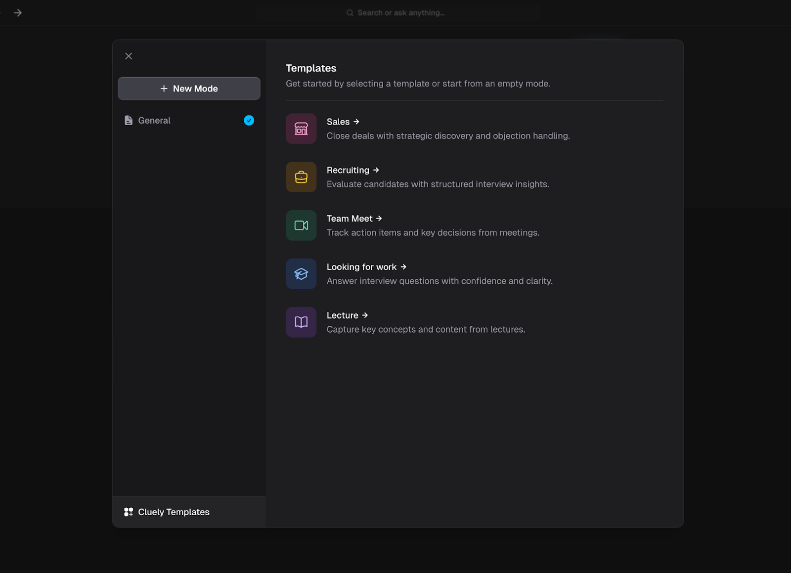
The different modes make it easier to use in specific situations. Sales Mode brings up helpful prompts during customer calls. Recruiting Mode picks out useful details in interviews. Lecture Mode focuses on the main ideas instead of tasks. Each mode gently nudges the tool to match the situation, something most meeting assistants fo not even attempt.
The meeting brief you get afterward is immediate and digestable. It shows decisions, action items and next steps right away, so you can move into your next call without trying to remember what happened. Everything is already laid out for you.
Where it falls short
Cluely is helpful, but it is not a mind reader. When a conversation moves very fast or gets complicated, its suggestions can feel a bit off or arrive a little late. It usually captures the main idea, but not the finer details, especially in technical discussions or any meeting with a lot of context.
The notes it creates are useful, but they are not ready to share as-is. You still need to read through them and make small corrections.
And although the tool supports multiple languages, multilingual accuracy depends on how clearly participants speak and how often they switch languages mid-sentence. Speaker separation can also be confusing in group calls where people talk at the same time or audio quality varies.
It also may not be the best choice for sensitive meetings. Even though you can control when it listens or records, some teams prefer to keep tools like this out of client calls, private conversations or situations with strict rules around confidentiality.
In short, Cluely works well when the goal is quick clarity, but it is not built for technical, fast-moving or sensitive conversations.
What makes it different
Cluely’s edge is that it is genuinely helpful during the call, not only after. You can ask questions, request a quick recap or get clarification in the middle of the conversation, which makes the tool feel genuinely useful in real time.
It also handles small but important parts of a meeting. It captures follow-ups, drafts emails, organises action items and lets you explore the transcript once the call is over. All of this can move into the tools you already use, like Slack, HubSpot, Salesforce, or Notion, which means you’re not juggling five different systems after every call.
Cluely is not built to run your entire workflow. It aims to make meetings easier to keep up with and less mentally tiring.
My take
Cluely solves a familiar problem, the gap between what was said and what you actually remembered. It helps in the moments where your brain simply cannot keep up. When you are presenting, your attention is split across screens, reactions and the fear of sharing the wrong tab, so you miss half the conversation without meaning to. And on the other side, there are the quieter moments where you drift for a few seconds and suddenly realise the discussion has moved three layers deeper. Cluely gives you the thread back without making you announce that you lost it.
Outside this, the tool is helpful but not something extraordinary. It will not decode complicated discussions or turn a messy meeting into a good one. But when you use it in the moments where most people actually struggle, it keeps you sane. It understands the call, remembers the important points and helps you move to the next task without carrying the entire conversation in your head.
AI in Product
Visily: UI Design for the Rest of Us
TL;DR
Visily turns prompts, screenshots, and sketches into editable UI screens, helping non-designers and fast-moving teams get to their first-workable draft quickly. It stands out for generating clean structures early-on, without overstepping into creative decisions.
Basic details
Pricing: Free plan available; Pro starts at $14 per editor per month
Availability: Browser-based
Best for: Non-designers, product managers and founders
Use cases: Quick UI drafts, recreating reference screens and mapping product flows
There’s a specific moment in product building that everyone hates: when you know what you want, but you have nothing to show for it. You say, “Imagine a simple grocery app home screen,” and someone nods, but no one really knows what you mean. Visily is built for exactly that moment.
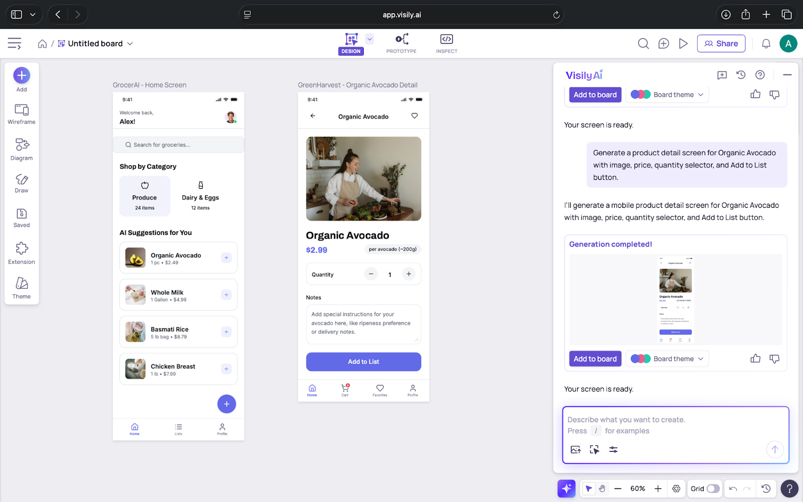
At its core, Visily is an AI-assisted UI design tool that helps you create screens quickly without needing design experience. You describe the screen, upload a competitor’s screenshot, or sketch something on paper, and the tool converts that into an editable layout. The objective is simple: move ideas from vague to visual without slowing down the team.
What’s interesting
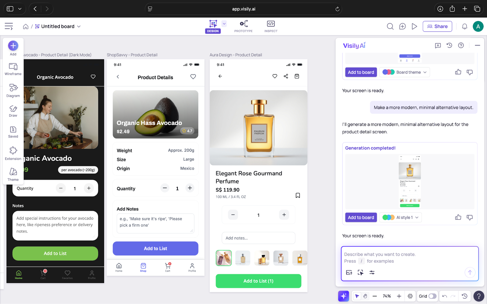
The most interesting part of Visily is how practical it feels. I tested it using the kind of prompts you normally say out loud in a meeting. A simple line like “grocery app home screen with product categories” generated a layout that looked like a baseline wireframe.
It gave me something clear enough to react to without needing to overexplain.
The screenshot feature was even more useful. I uploaded a screen from an existing app and wanted to see how well Visily could break it down. It did not simply trace the layout. It separated the screen into editable pieces such as headers, cards, buttons and text blocks. This cuts out a lot of manual effort, especially during competitive research.
Another detail that stands out is how Visily handles smaller tasks that usually slow you down. It renames layers, adjusts spacing, creates dark mode versions and generates themes from text or images. These are not the features that draw attention, but they help maintain momentum.
Visily also stays within reasonable boundaries. It does not try to guess your entire flow or invent patterns that do not exist. Its output is stable and predictable, which helps build trust in what you are working with.
Where it works well
Visily works best at the beginning of the design process. This is the stage before branding decisions, high-fidelity work or long conversations about spacing. It helps teams turn early ideas into something they can see and discuss without waiting for a designer.
It is well suited for
PMs and founders who want to visualise ideas quickly
Engineers who need clarity on flow and layout
Designers who want to skip repetitive setup and explore more directions
Teams building internal tools where clarity matters more than finesse
It is especially helpful in fast brainstorming sessions. Instead of debating ideas verbally, you can generate a few variations in minutes and immediately see what direction works. It keeps the focus on understanding the idea rather than the mechanics of drawing it.
Where it feels short
Visily works well when the screens are simple, but it struggles when layouts become more detailed or unusual. It handles common mobile and web patterns without issues, but dashboards, multi-column pages, and admin-style interfaces do not come through as accurately. These screens usually need manual fixes because the tool streamlines the layout instead of capturing the full structure.
It can also get tedious to keep scenes consistent across a large project. When you restyle or regenerate a screen, small things like spacing, alignment, or text styles may shift. Visily has components, but they do not have the same flexibility as those in Figma. This makes it harder to reuse patterns or maintain a design within the tool.
Visily is ideal for smaller projects. As soon as you stack multiple screens on one board or have several people working together, the canvas can feel slower. This may seem common for browser tools, but it is still noticeable when you are moving quickly.
You can export work to Figma, but it is not a perfect transfer. Layers do not always import cleanly, and constraints often need reorganising. Designers usually spend a little time tidying up the file before they continue.
Since Visily is fully cloud-based, a stable internet connection is important. If the connection is weak, features like generation and editing slow down or pause.
What makes it different
The difference with Visily is much easier to understand when you compare how long the same tasks take in other tools. In Figma, recreating a reference screen can take 20-30 minutes of manual work; in Visily, you can get an editable version in seconds. Uizard offers something similar, but Visily’s output tends to preserve hierarchy and spacing more accurately, especially for mobile layouts.
The prompt-to-screen feature is also more controlled than most alternatives. Instead of generating an entirely new style each time, Visily keeps to a predictable structure, which makes it easier to iterate without starting over. This is useful when you’re exploring variations rather than looking for an entire redesign.
Another area where it stands out is how it handles smaller details automatically. Text styles, spacing, and basic grouping are applied consistently across generated screens. These aren’t some out of the box features, but they cut out routine steps that usually slow down early drafting.
And compared with tools like Uizard or Canva, Visily is clearly oriented toward product surfaces rather than marketing layouts. The components it produces such as cards, navigation bars, headers, form elements, match what you’d expect in real apps, not generic templates.
My take
Visily is a useful companion for teams who move quickly and don’t want to get stuck in the “I’ll mock this later” loop. It helps you get visual clarity early without pulling a designer into every initial discussion.
For early drafts, internal tools, flow mapping, and quick product conversations, it’s absolutely worth having in your toolkit.
AI in Design
Rive: Bringing Interactive Motion Into Everyday Product Design
TL;DR
Rive lets you create lightweight, interactive animations that react to user input, making it valuable for teams who want their UI to feel more responsive. It works best for small interactions that make a product feel clearer and easier to use.
Basic details
Pricing: Free plan available; paid plans start at $9 per seat per month (required to ship your builds)
Availability: Browser-based
Best for: Motion designers, product designers and front-end teams
Use cases: Micro-interactions, UI animations and responsive icons
I am not a motion designer, so my first impression of Rive was that it looked like another animation tool. But after speaking with a motion designer and trying it myself, I realised it solves a very different problem. Most animation tools create files that play the same way every time. Rive lets you build animations that respond to what a user does. That small shift changes how motion fits into a product.
For example, a button does not just animate once and stop. It can react when you hover, when you click or when you drag. An icon can change its state based on input. A loader can move differently depending on real progress. Instead of creating a single animation sequence, you create behaviour that feels connected to the interaction.
Rive is designed to help you build motion that feels smooth, lightweight and integrated into the product rather than added on top. Even as someone outside the design world, I could see why teams use it to bring more personality and clarity into their interfaces.
What’s interesting
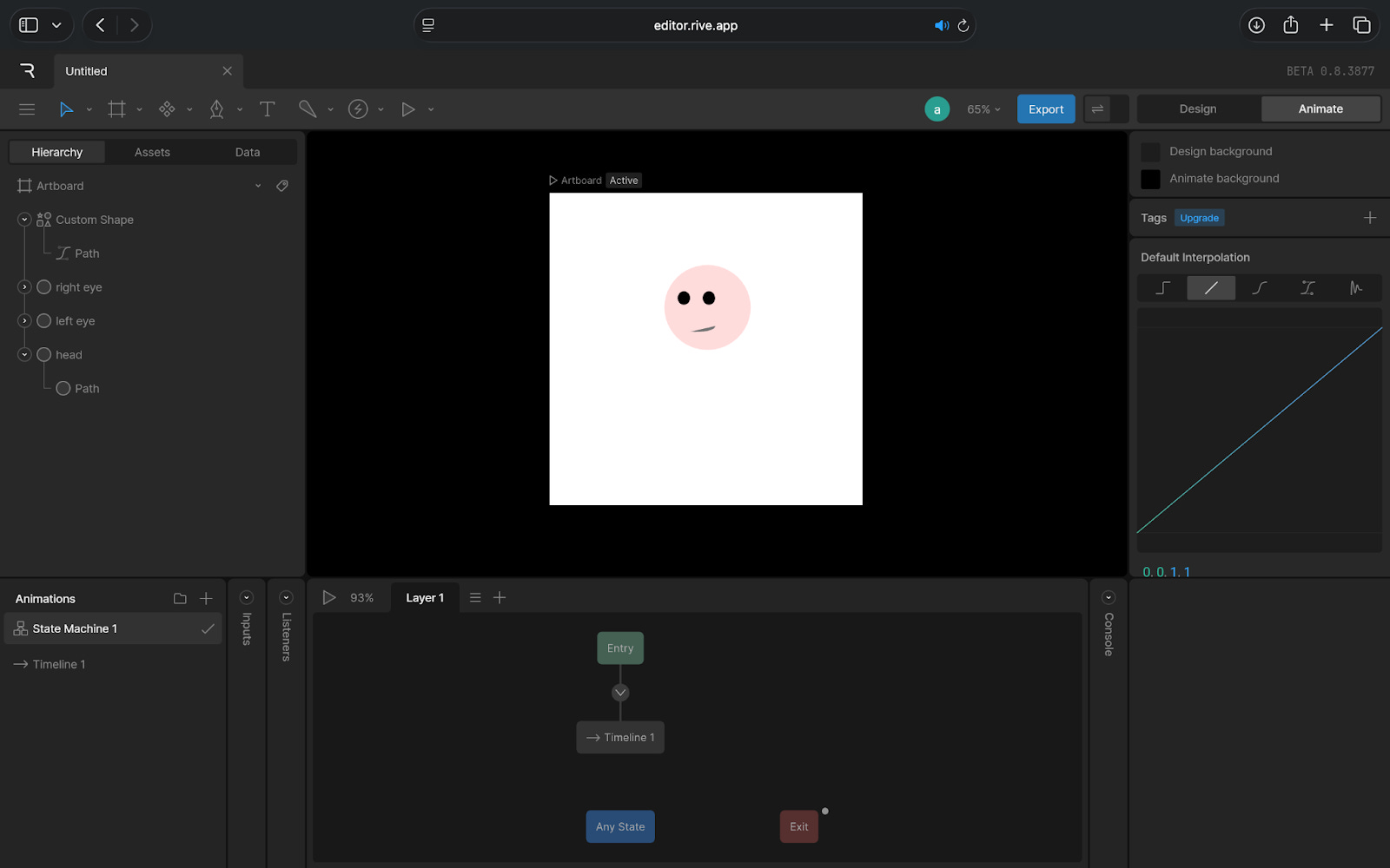
The most interesting thing about Rive is how it blends design and behaviour. You are not just drawing frames. You are defining how the animation should respond. This can be done using The State Machine which lets you connect different animation states to triggers like hover, tap or drag.
What’s more is how smooth and lightweight everything feels. Rive animations run in real time across web, iOS, Android, Flutter and even game engines. You’re not exporting videos or large files. You’re exporting instructions for how motion should behave.
The editor also keeps design and animation in one place. You move between Design Mode and Animate Mode without switching tools, which helps keep the workflow consistent. What you create in Rive is exactly what developers implement, because you share the animation as a small embed snippet or code.
And when you look at Rive’s example library, you understand what the tool is built for: buttons that bounce, toggles that glide, icons that react when dragged, characters that move with input. These small pieces show how Rive changes the feel of a product without changing its structure.
Where it works well
Rive is most helpful in the parts of a product where small interactions make a big difference. This is usually when a simple visual response can guide the user, reduce confusion or make the interface feel more efficient.
It works especially well for things like buttons, icons, toggles and loading states because these elements need to react quickly and clearly. A subtle change in motion can tell the user that something was clicked, something is in progress or something has updated.
It is also strong in onboarding or educational flows, where movement can help direct attention without overwhelming the screen. Because Rive supports data-driven motion, animations can respond to live information too, which makes it useful in dashboards or metrics-heavy interfaces where visuals need to update smoothly.
In short, Rive works best in small, frequent interactions across a product. These are the places where responsive motion improves the experience without getting in the way.
Where it falls short
Rive is impressive, but it is not the easiest tool to pick up if you are new to motion. The idea of connecting different states and setting up how an animation should react takes some time to understand. If your background is in static design tools, the learning curve can feel noticeable at first.
It is also not the right choice for long or detailed animations. Tools like After Effects are still better for storytelling, complex sequences or anything that needs heavy visual effects. Rive works well with short, interactive moments, not in full cinematic motion.
There is a practical consideration too. Developers need to know how to implement Rive files in the product. The workflow is smoother than handing off video files, but it still requires coordination between design and engineering.
What makes it different
Rive stands out because it treats motion as part of the product experience rather than a final layer added at the end. Instead of designing an animation somewhere else and hoping it works once it is implemented, Rive lets teams experiment, test and refine motion earlier in the process. This makes animation feel more integrated and less like something that gets patched in later.
It also sits in a very specific place among its competitors.
Lottie is great for simple animations, but what you export is fixed. It plays, loops or reverses, but it cannot respond to user input.
After Effects gives you creative freedom, but the output is heavy and not suited for real-time product interactions.
Figma’s animation tools work well for prototypes, but they are not designed for production-level motion or long-term use in an app.
Rive fills the gap between these tools. Designers can define how motion behaves without coding, and developers can use the animation directly without rewriting it. This reduces the usual friction between design and engineering and makes motion feel like a natural part of the product, not an added effect.
My take
Rive is one of those tools that makes more sense once you see it in action. Even as someone who is not a motion designer, I could understand how much it helps with everyday product interactions. It makes buttons, icons and small UI moments feel clearer and more responsive, which is something most teams struggle to get right.
At the same time, it is not a plug-and-play tool. You need to spend time learning how it works, and not every team has the bandwidth or the motion mindset to adopt it smoothly. When the skills and use cases line up, the results are impressive. When they do not, the tool can feel heavier than expected.
For teams that care about the details of how a product behaves, Rive offers real value. For teams that only need simple visuals or basic animations, the extra effort may not be worth it.
In the Spotlight
Recommended watch: Why Cluely is leaning into real-time, context-aware AI
This podcast breaks down Cluely’s core idea in a way product demos don’t: an assistant that sees your screen, hears your calls and helps without waiting for a typed prompt. Roy Lee talks about why this feels like the next step beyond chatbots, how real-time context changes the value of AI and why Cluely is positioning itself as the application layer built to ride future models rather than compete with them.
The problem with ChatGPT right now is that you have this super intelligent model, but it can only answer the questions that you like to type in… why limit it to only the text question that you ask it?
This Week in AI
A quick roundup of stories shaping how AI and AI agents are evolving across industries:
Claude Code comes to Slack, giving teams the ability to generate, fix, and reason through code directly inside their day-to-day communication tool. It is a bigger shift than it appears, because it moves AI from “a place you go” to “a layer inside where you already work,” especially for engineering teams.
Google introduces Doppl, a new AI-powered discovery feed that pulls together outfit ideas, virtual try-ons, and shoppable looks in one place. Instead of searching for products manually, users can browse AI-curated styles that update as they interact, blurring the line between inspiration and commerce.
Workspace Studio brings AI agents into Gmail, Drive, and Chat, turning Google Workspace into an orchestrated system rather than individual apps. These agents can draft messages, organise files, suggest follow-ups, and help teams stay on track across tools, signalling Google’s push toward a more automated, assistant-driven workflow.
AI Out of Office
AI Fynds
A curated mix of AI tools that make work more efficient and creativity more accessible.
Visual Electric → A fast image-generation tool for quickly exploring visual styles and concepts.
Brushless → An AI sketching tool that turns rough drawings into clean, stylised illustrations.
AI Image Editor → A browser-based editor for instant background removal, cleanup and image enhancements.
Closing Notes
That’s it for this edition of AI Fyndings. With Cluely easing the pressure of fast-moving meetings, Visily helping ideas take shape faster and Rive bringing interaction to life, this week was all about improving the parts of work we often overlook.
Thanks for reading! See you next week with more tools, shifts and ideas that show how AI is slowly reshaping the way we work.
With love,
Elena Gracia
AI Marketer, Fynd