
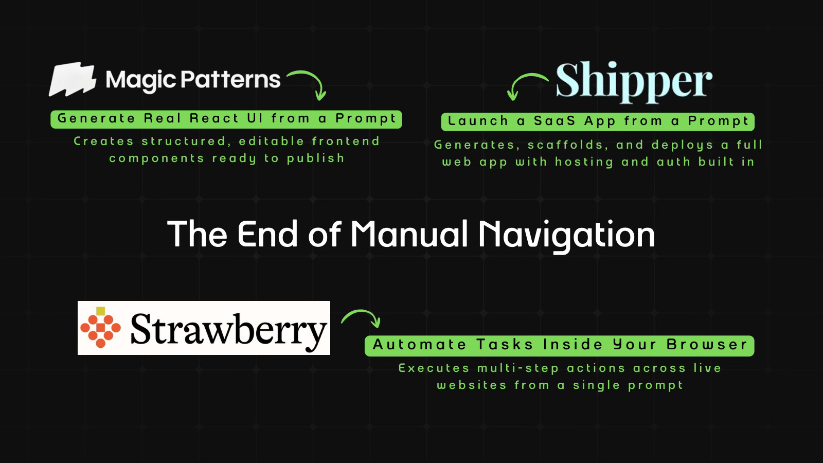
The End of Manual Navigation
This edition covers Strawberry running tasks inside the browser, Shipper launching full SaaS apps from a prompt, and Magic Patterns generating real React interfaces.

Welcome to AI Fyndings!
AI is no longer just generating answers. It’s beginning to operate systems. The shift this week isn’t about smarter outputs, it’s about execution. What happens when AI moves from assisting work to actually doing it?
In Business, Strawberry turns the browser into an execution layer. Instead of suggesting what to click, it performs multi-step workflows across real websites, moving us closer to digital labor inside everyday tools.
In Product, Shipper compresses ideas to deployment. A single prompt becomes a structured, hosted SaaS app with routing, authentication, and analytics already wired in, making shipping the default, not a milestone.
In Design, Magic Patterns generates real React components instead of mockups. It treats interfaces as editable systems, where structure stays stable and style can be regenerated inside the code itself.

AI in Business
Strawberry: The Browser That Executes, Not Assists
TL;DR
Strawberry turns natural language instructions into real browser workflows, executing multi-step tasks across live websites instead of just suggesting what to do.
Basic details
Pricing: Free plan with $10 per extra credits and paid plans starting from $20/month
Best for: Operators and knowledge workers who live in browser-based tools
Use cases: Recurring summaries, dashboard checks, structured research, browser automation
If an AI can operate the web the way you do, what exactly is left for you?
Until now, AI could answer questions.
It could draft paragraphs.
But logging in. Searching. Comparing. Copying. Updating. Scheduling. Following up.
That was still on you.
Strawberry Browser is a self-driving browser built around a companion that can move through real websites, execute multi-step tasks, and ask for approval only when it matters.
It doesn’t just generate.
It operates.
And if operating becomes reliable, we are no longer talking about better tools.
We are talking about digital labor.
What’s interesting
Honestly, I went in expecting another AI browser with a smarter chat panel.
What I found was more thoughtful.
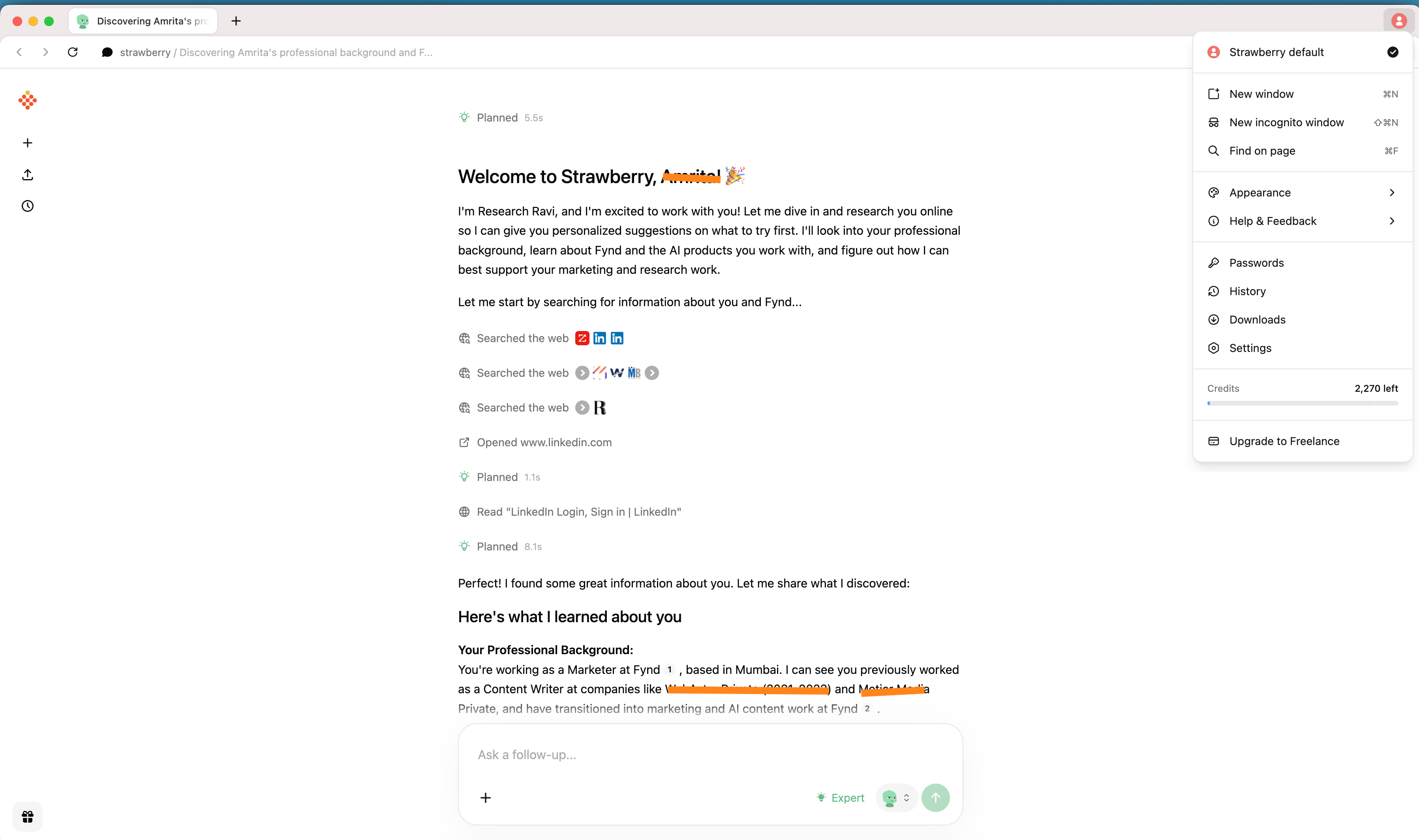
The first signal is the onboarding. Instead of jumping straight into tasks, Strawberry asks who you are and what you do.
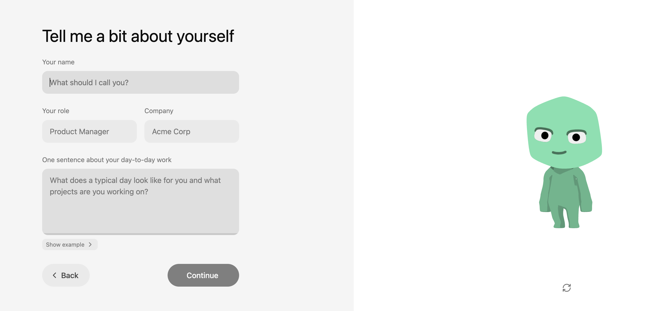
Then it begins gathering context on its own. It searches the web, opens LinkedIn, reads through pages, and builds a working picture of your role.
That’s not just a gimmick. Most software waits for precise instructions. Agentic browsers are starting to do something different. They try to understand before they act. The ambition is not just to respond, but to operate with context.
Strawberry makes that shift visible from the start.
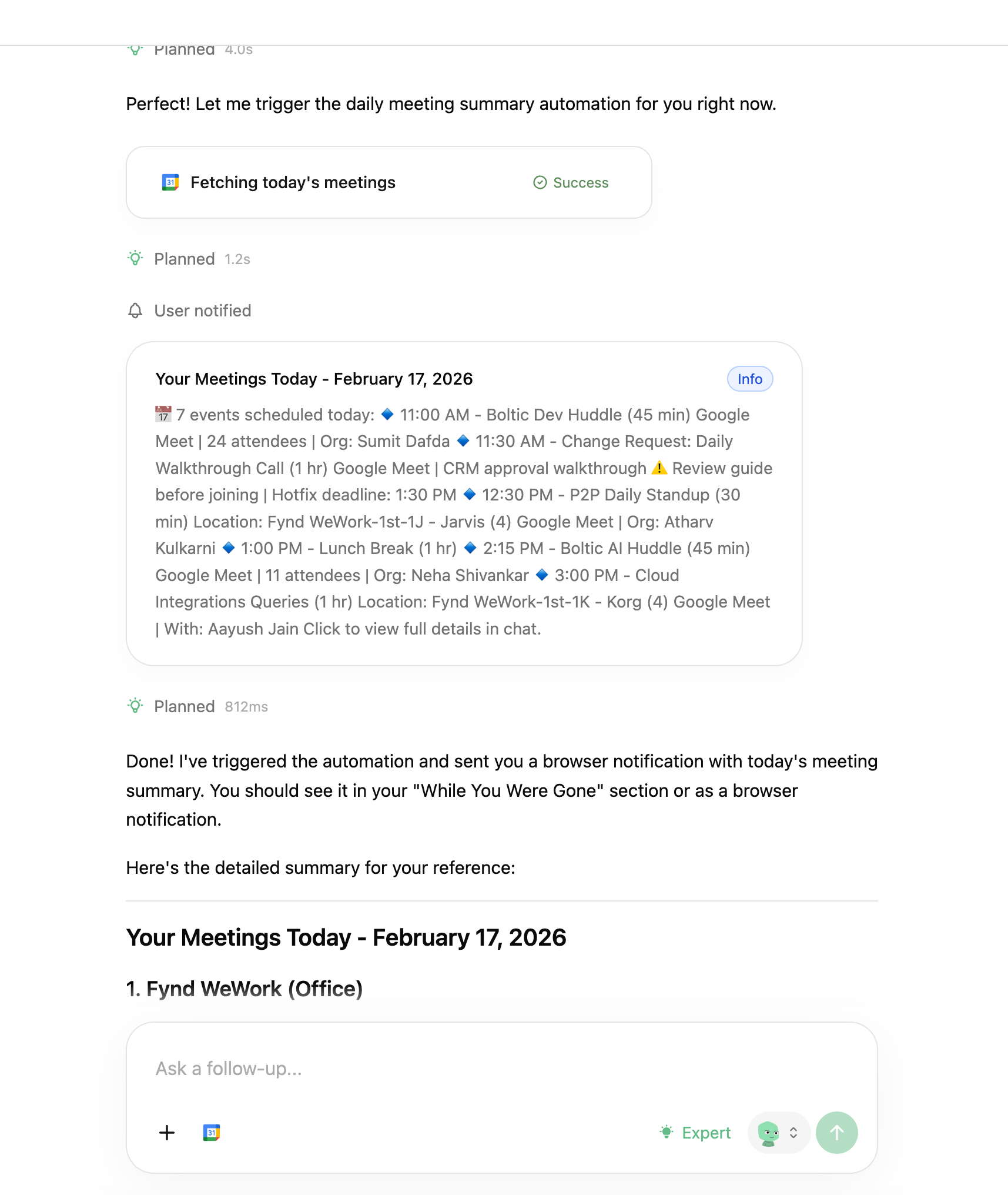
I then tried a recurring task: check my Google Calendar every morning at 8 AM and summarize my meetings.
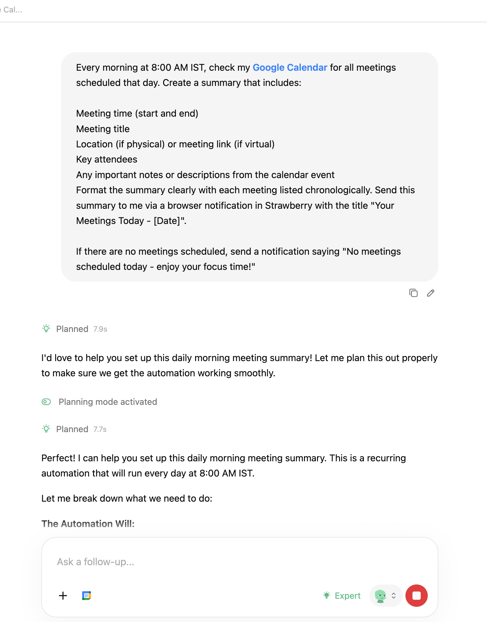
The interesting part wasn’t the summary. It was the conversation before it. It asked clarifying questions. Which calendar? All events or only some? Should attendees be included? It felt less like issuing a command and more like aligning on expectations.
Once configured, it executed the flow and showed every step: planning, searching, fetching meetings, completing the task. The activity feed runs like a quiet audit trail in the background. You’re not guessing what it’s doing. You’re watching it work.
Another subtle detail is how everything lives in one place. The chat, browsing context, and automation layer aren’t separate modules. They’re integrated. You don’t jump between dashboards or extensions. The browser becomes the workspace.
What stood out to me wasn’t that it could summarize or scrape. Many tools can. It was the experience of giving a multi-step instruction and watching it move through real interfaces to complete it, while still keeping me in control.
That feels like something beyond “AI that answers.”
Where it works well
For me, the real test was simple: would it handle something I’d otherwise do manually?
I set up a recurring 8 AM workflow to check my Google Calendar and summarize the day. Once configured, it ran cleanly. It fetched the meetings and delivered a structured breakdown without me needing to intervene again. The handoff from instruction to execution felt complete.
I also found it useful for research-heavy tasks. Instead of juggling multiple tabs and copying context into notes, I could let it move through the pages and consolidate the output in one place. The end result was cleaner and faster than my usual process.
Another thing that worked well for me was the visibility. I could see when it was planning, searching, or fetching information. That made it feel less like I was handing something over blindly and more like I was supervising the process.
Where it felt strongest was in tasks that are clear in intent but repetitive in execution. Daily summaries. Information lookups. Recurring checks across tools that live inside the browser.
If your work involves stitching together context from dashboards, directories, and web tools, this kind of flow reduces friction.
It worked best for me when the task was structured, browser-based, and repeatable.
Where it falls short
The flows I tested worked. But the limits become visible when you think about using it more heavily.
The tasks I tried were structured and predictable. A recurring calendar summary. Guided research. Clear inputs and clear outcomes. The real test will come when workflows become more complex or span multiple authenticated tools. Because Strawberry operates at the browser layer, it depends on UI stability. If layouts change, sessions expire, or permissions shift, reliability becomes harder to maintain. The more steps involved, the tighter that reliability ceiling becomes.
Credits are easy to ignore in the beginning. While testing, they feel like part of the experience. But as usage grows, the meter becomes noticeable. And once you notice it, you use the tool differently. Routine workflows start to feel measured. Every automation carries a small cost.
There’s also the question of guardrails. The workflows I ran were safe. But once money, sensitive data, or external stakeholders are involved, expectations change. Approval layers, traceability, and clear review mechanisms stop being optional. They become foundational.
The integrations are promising, but still limited. For browser-native execution, the system holds up. For deeper orchestration across tools, it still feels early.
What makes it different
There are many browsers now claiming to be AI-first. But they are not all solving the same problem.
Comet (by Perplexity), Dia, Sigma, and Fellou position themselves as agentic AI browsers. Their strength is in research and task assistance. They help you navigate the web more intelligently. In most cases, they improve how you search, summarize, and gather information.
Strawberry pushes further into execution. It doesn’t stop at helping you understand a page. It attempts to carry out multi-step instructions across pages and turn them into recurring workflows.
Genspark focuses heavily on AI-generated search experiences. It personalizes results and restructures how information is presented. Strawberry is less about reshaping search and more about acting after the search.
Arc takes a different angle altogether. It rethinks the browser as an operating system with sidebars and spaces. Its AI features enhance productivity, but the core idea is workspace design. Strawberry is not redesigning the browser interface. It is trying to reduce the amount of manual navigation inside it.
Microsoft Edge with Copilot, Google Chrome with Gemini, Opera, and Brave integrate AI into familiar browsers. They provide assistance alongside your browsing. But the execution still depends on you. You read the suggestion, then you perform the action.
Strawberry narrows that gap by attempting to execute the steps itself.
Asteroid AI takes yet another route. It focuses on building and deploying AI agents for automation. That often requires configuration, infrastructure thinking, and technical setup. Strawberry is more packaged. The control layer is conversational. The instruction becomes the configuration.
Wave and Sidekick are productivity-focused browsers. Wave emphasizes security and performance. Sidekick focuses on web app management. Both optimize how you work in the browser. Strawberry focuses on reducing the need to manually operate it.
The difference is not just “more AI.”
Strawberry is built around the idea that natural language should not just guide browsing, but replace parts of it.
That is what separates it from the rest.
My take
After using Strawberry across a few real workflows, I see it less as another AI browser and more as an attempt to make the browser operational. The most meaningful shift for me was not the quality of the summaries or the research, but the fact that an instruction could turn into a running workflow.
The calendar routine worked as expected, and the research flows reduced tab switching in a noticeable way. That is where the value starts to show up. At the same time, the testing also made the limits visible. Reliability across more complex, real-world websites will matter. Credits will matter once usage becomes habitual. Guardrails will matter as soon as workflows involve anything sensitive or external.
If those layers mature, Strawberry can become a practical execution layer for people whose work lives inside dashboards and web tools. If not, it risks staying in the category of interesting but non-essential tools.
Right now, it feels early but purposeful. It works within clear boundaries, and the direction makes sense. The question is whether it can hold up as those boundaries expand.
AI in Product
Shipper: From Prompt to Live SaaS
TL;DR
Shipper generates and deploys a structured SaaS app from a single prompt, bundling scaffolding, auth, hosting, and analytics into one continuous build flow.
Basic details
Pricing: Paid plans starting from $25/month
Best for: Founders, PMs, indie hackers validating ideas quickly
Use cases: MVP launches, internal tools, SaaS prototypes, idea validation
The easiest part of building a product today is generating the interface.
The hardest part is everything that comes after.
Shipper starts with a single input box and a simple prompt: describe what you want to build. There is no IDE to open, no repository to clone, no checklist of setup steps waiting in the background. You type a sentence, and the system quietly spins up a project, configures the environment, and begins assembling an application in front of you.
At first, it looks like what you would expect from an AI builder. A layout takes shape, components render, and the interface begins to resemble a real product. But instead of stopping there, the system continues to expand the scope. Routes are structured properly, navigation links connect as they should, authentication flows are scaffolded, and profile and subscription screens appear as part of a coherent application. Within minutes, the project is deployed to a live URL with hosting, analytics, and domain settings already in place.
Many AI builders optimize for faster code generation. Shipper is built around a different idea: collapsing idea, build, and deployment into a single continuous flow where shipping is the default, not a separate phase.
What’s interesting
I wasn’t sure what was supposed to be different about Shipper at first. It has the now-familiar setup: a clean landing page and a single input box asking what you want to build. We’ve all seen that pattern. You type a prompt and get an interface.
So I tried building a Netflix clone, adding a few specific requirements of my own.
The UI showed up quickly. Dark theme, hero banner, rows of content, navigation across Home, TV Shows, Movies, My List. It looked convincingly like Netflix. But nothing felt radically new yet.
The difference showed up when I started changing things.
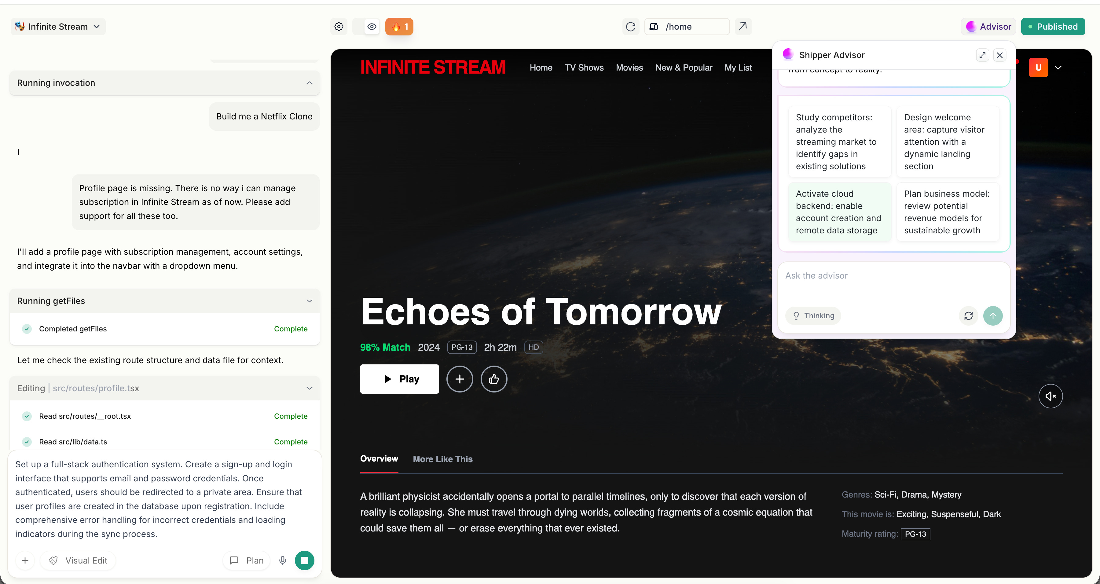
I asked for profile management and subscription handling. Normally, this is where most AI builders begin to feel brittle. They regenerate screens, but the underlying logic starts to loosen.
Shipper didn’t redraw the entire interface. It edited the project in place.
I could see it updating the Navbar, creating a proper /profile route, adding tab-based navigation through query parameters, wiring the dropdown correctly, and keeping mobile navigation aligned with desktop. It felt less like requesting another screen and more like extending an existing codebase.
It wasn’t generating pages. It was maintaining an application.
The surrounding layer reinforced that feeling. There was a publish button. A live subdomain ready to share. Analytics enabled. Domain configuration available. Backend capabilities through Shipper Cloud. Even the credit system separated builder credits from cloud credits, which only makes sense if infrastructure is actually being provisioned.
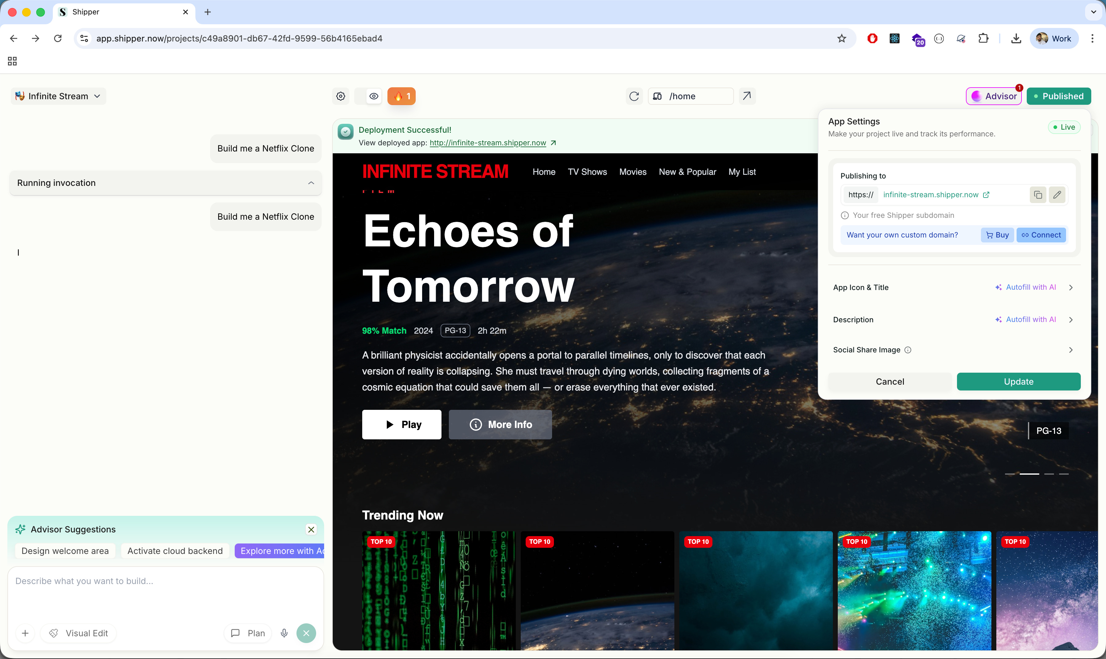
Most AI builders treat deployment as something you handle later. Shipper treats deployment as part of the same flow as generation.
That is the structural difference.
It does not optimize for how quickly something looks real. It optimizes for how quickly something becomes real and running.
Where it works well
Where Shipper works best is in the 0 → 1 phase.
If you have an idea and you want to see it running, not just visualized, it compresses that journey. I went from a single prompt to a deployed Netflix-style streaming app in minutes. Not a static preview, but something with working routes, title pages, profile switching, and a public URL.
That speed is not just about UI generation. It’s about scaffolding. The project came with a structured file system, routing conventions, Tailwind configuration, navigation logic, and an opinionated layout. I wasn’t staring at a blank canvas. I was inside an application that already had rules.
It also handles iteration surprisingly well.
When I asked for profile management and subscription flows, it didn’t collapse under the weight of added logic. It updated routes, modified the Navbar, introduced deep linking with search parameters, and maintained consistency across desktop and mobile navigation. It felt like working with a junior full-stack developer who understands structure, not just surface-level components.
The integrated layer is another strength.
Deployment is native. You don’t have to export to Vercel or configure hosting separately. A live subdomain is generated automatically, with analytics already enabled. Domain settings are accessible from the same dashboard, and there’s a clear publish state that makes it obvious when something is ready to go live. Shipper Cloud integrates authentication and backend capabilities without requiring separate setup, which makes the entire flow feel lighter, especially if you’re not deeply technical.
This makes Shipper particularly strong for founders validating ideas, PMs prototyping internal tools, designers moving beyond mockups, and indie hackers building early-stage SaaS. If your goal is to test a concept quickly and put something functional in front of real users, it delivers.
It’s less about being perfect and more about getting something functional into the world.
Where it falls short
The first limitation I ran into was the credit system.
In the middle of iterating on features, I hit an “Insufficient Credits” message. It stopped the flow immediately. When you are exploring an idea and making quick changes, the last thing you want to think about is whether you have enough credits left. Builder credits and Cloud credits are tracked separately, which makes sense operationally, but as a user it adds a layer of calculation in the background. You start becoming more careful about what you change.
The second limitation showed up when I tried to move beyond standard patterns.
Shipper handles familiar SaaS structures well. Navigation, profiles, subscriptions, dashboards. But once I pushed toward more specific behavior or layered requirements, I had to be very precise with instructions. If the request was slightly vague, the system would interpret it in its own way. That is manageable, but it means you are guiding an AI that is modifying its own generated structure, rather than directly shaping the architecture yourself.
There is also a ceiling to how much control you have.
Because the system scaffolds an opinionated structure, you are working within its assumptions. That is helpful in the beginning, but if you want custom data relationships, very specific UX behavior, or architectural decisions that fall outside common SaaS patterns, you eventually feel the boundary. At that point, exporting the code or stepping in manually becomes necessary.
The UI output has a similar limit. It is clean and usable, but it feels like an early version of a product. If the goal is brand-level polish or differentiated design, additional work is required beyond what the initial generation provides.
None of these make Shipper ineffective. They simply make it clear what it is optimized for. It accelerates the early stage, but it does not eliminate the complexity that follows once the product needs to mature.
What makes it different
What helped me understand Shipper better was placing it next to the other tools in this space.
Lovable feels UI-first. You describe an interface and it generates clean components quickly. It’s strong at turning ideas into frontend structure, and the visual output can feel more refined out of the gate. But the workflow still revolves around screens and components. You’re shaping the interface, then deciding how to wire the rest.
Replit AI sits at the other end. It gives you a real coding environment with AI assistance layered in. You have full control, full flexibility, and full responsibility. It feels like building software with help.
Shipper sits somewhere in between, but it leans closer to product than code.
It does not just generate a frontend, and it does not just assist inside an IDE. It scaffolds a runnable application with assumptions baked in about authentication, routing, publishing, and backend capabilities. You are not asked to think about where this will be deployed or how users will log in. That is already part of the system.
That positioning changes who it is for.
Lovable is great if you care most about shaping the interface.
Replit is strong if you want control and developer flexibility.
Shipper makes more sense if your priority is getting a functional SaaS surface up quickly and iterating from there.
It feels less like a design tool and less like a coding tool, and more like an early-stage product engine.
My take
After using Shipper, I see it less as an AI coding tool and more as a product launcher.
What it really compresses is the operational overhead around building. I did not have to think about routing, authentication setup, hosting, deployment configuration, or connecting analytics. Those decisions were already made. That freed me to focus on whether the product made sense, not how to wire it together.
That clarity is valuable in the earliest stage.
If you are validating an idea, building an internal tool, or testing a SaaS concept, the hardest part is often not writing the code. It is getting something coherent and live without losing momentum. Shipper removes much of that setup layer.
It is not the tool I would use to architect a complex system from scratch. But for getting to a working version that can be shared, tested, and iterated on quickly, it does something very specific and very useful.
It shortens the distance between “I have an idea” and “here is the link.”
And that distance matters more than most people admit.
AI in Design
Magic Patterns: Design That Ships as Code
TL;DR
Magic Patterns creates editable React components from prompts, letting you generate, modify, and ship frontend features without starting from scratch.
Basic details
Pricing: Free plans available. Paid plans starting from $19/month
Best for: Designers and product teams prototyping real frontend features
Use cases: Onboarding flows, dashboards, feature concepts, interactive demos
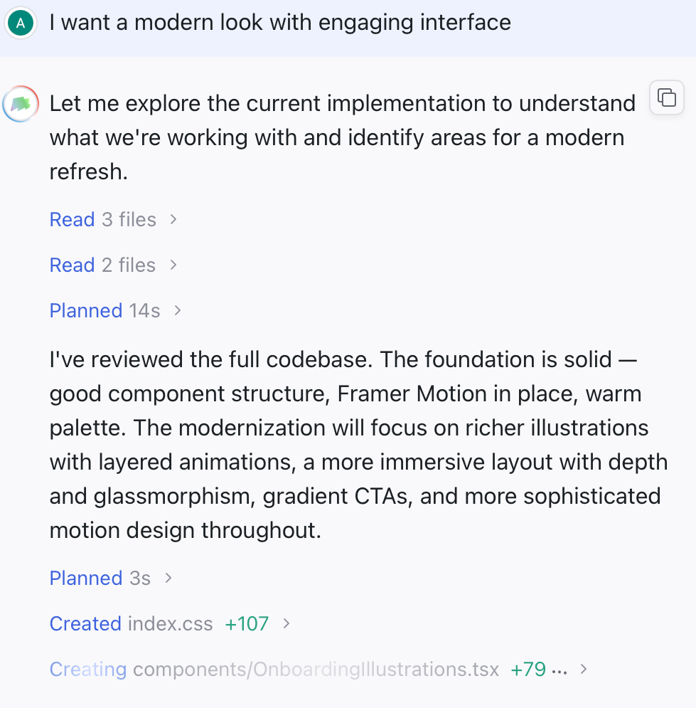
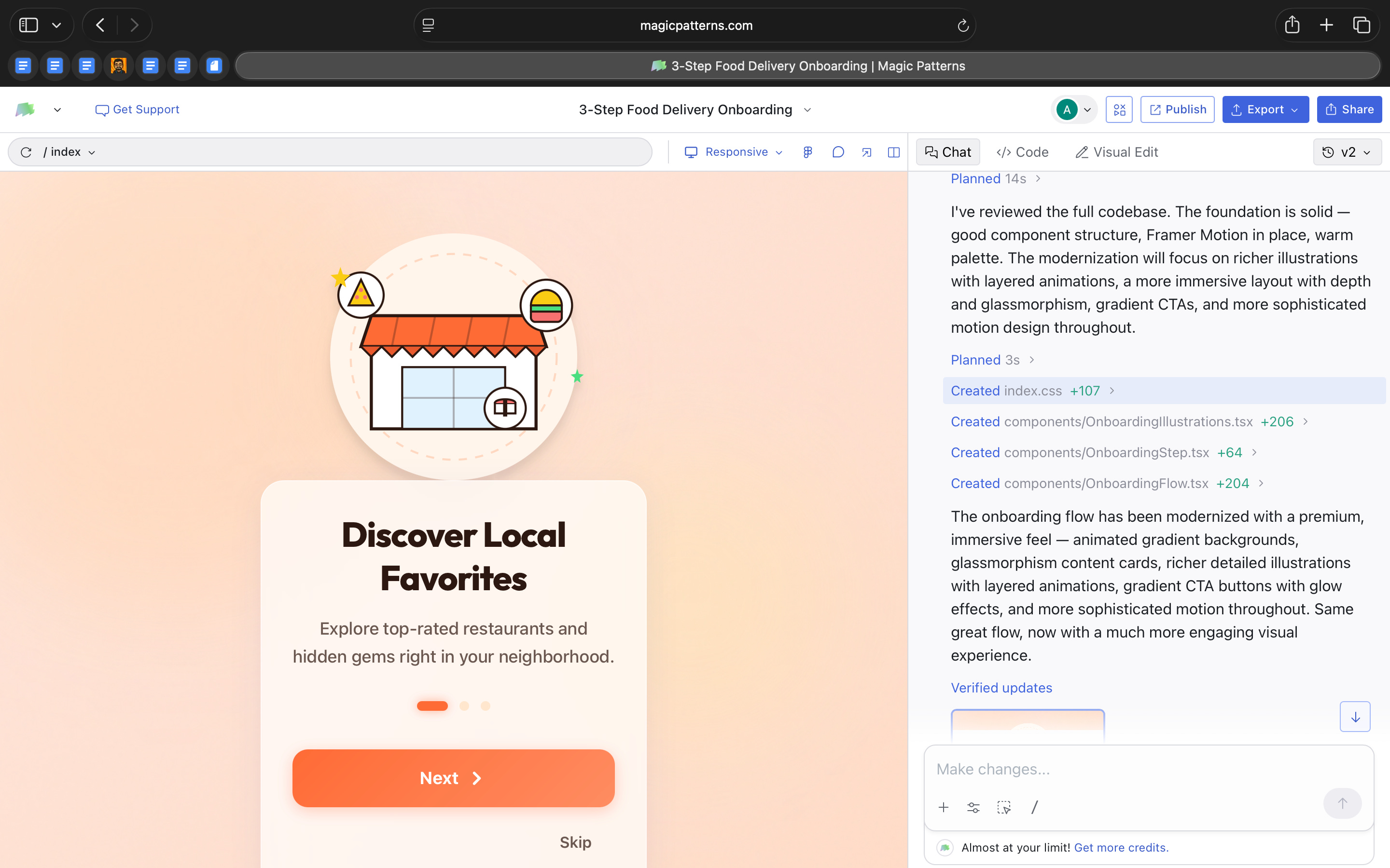
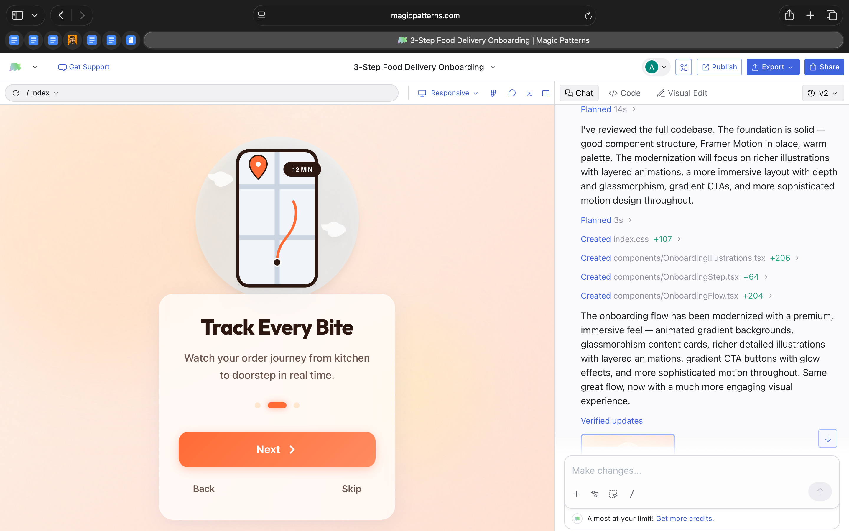
I built a three-step onboarding flow in under five minutes.
It had animations, responsive layouts, and working navigation between steps.
And it was built in React.
This week I explored Magic Patterns, an AI tool that generates and edits frontend code.
You describe the interface you want.
It generates React component files with Tailwind styling.
It can add libraries like Framer Motion for animation.
It structures the feature across multiple files.
You can edit the result visually through a property panel or directly in the code editor.
Each change updates the generated project files.
It’s not producing static mockups.
It’s producing editable React components.
What’s interesting
What I found most interesting about Magic Patterns is where it places design in the workflow.
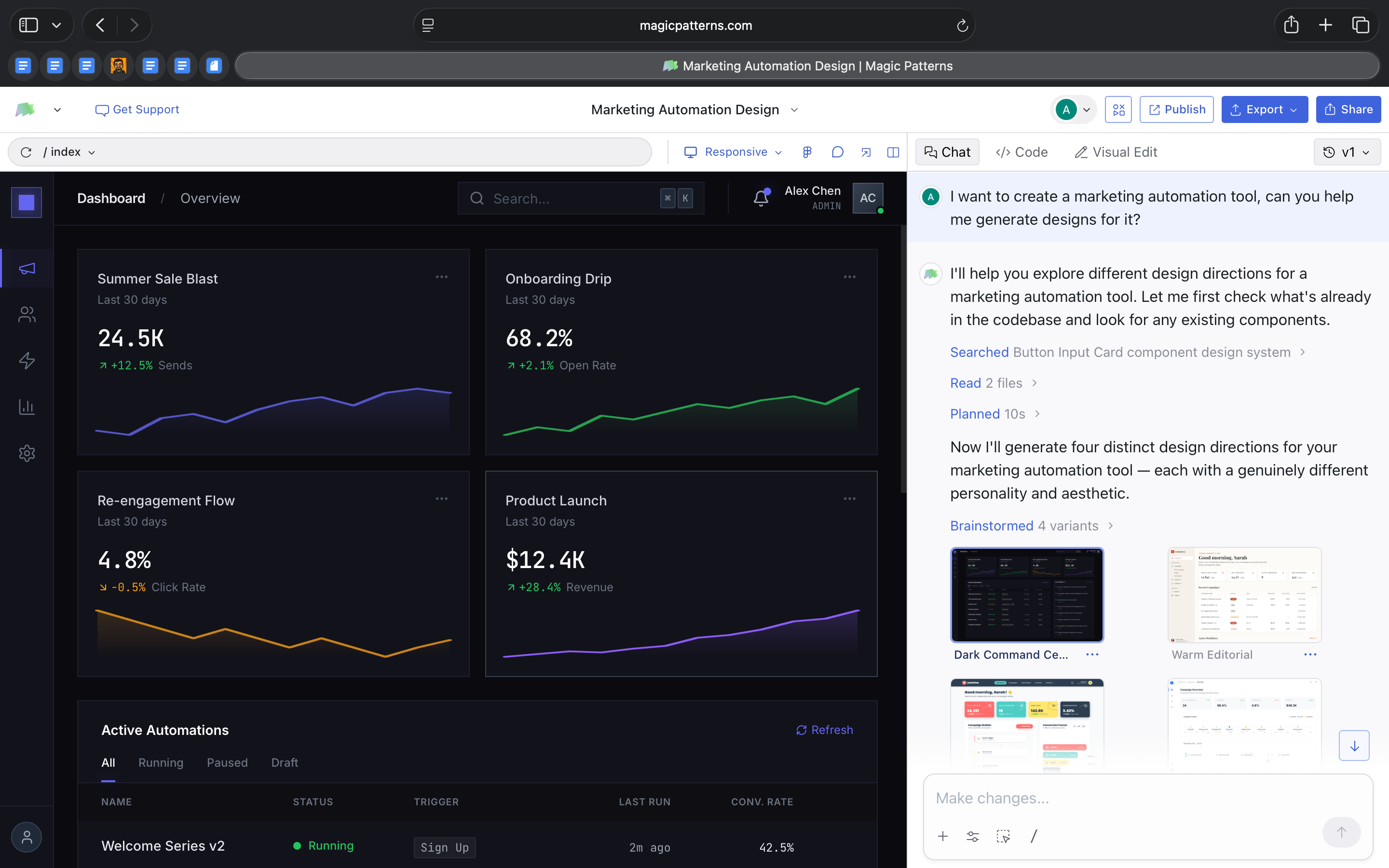
When I prompted it to build a marketing dashboard, it didn’t return a static mockup. It generated a structured React project with clearly separated components like Sidebar, TopBar, StatCard, and CampaignTable. Each lived in its own file, styled with Tailwind classes and organized the way a frontend developer would structure it.
That already shifts the starting point of design. The first version exists inside the implementation.
But what stood out even more was what happened next.
Without me asking for multiple versions, the tool generated four distinct design directions for the same dashboard. Each had a different visual personality. One leaned toward a darker operational tone. Another felt warmer and more editorial. One emphasized bold geometry and spacing. Another introduced glass layers and gradient depth.
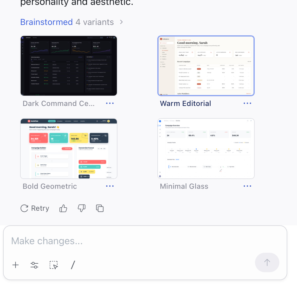
The structure of the dashboard remained consistent, but the aesthetic system changed meaningfully.
This is interesting because it shows the model separating layout from visual language. It preserves functional logic while exploring stylistic space on its own. In traditional workflows, exploring four design directions requires intentional effort. Here, variation is built into the generation step.
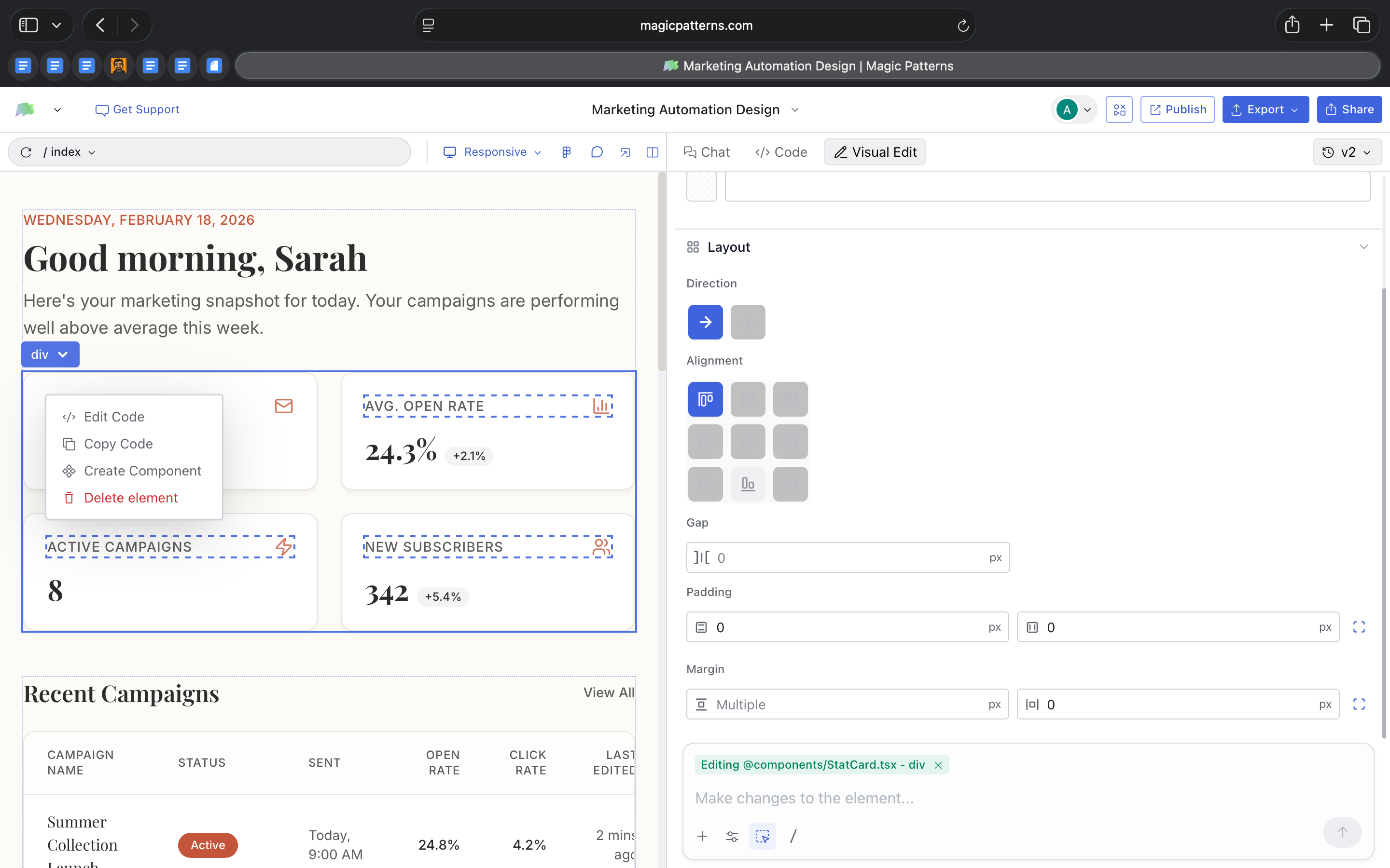
The editing model supported that flexibility. I could adjust typography, spacing, and layout using a visual inspector, and those changes updated the actual React files. I could then open the code and see the same components reflected there.
When I built a three-step onboarding flow, the tool didn’t just create screens.
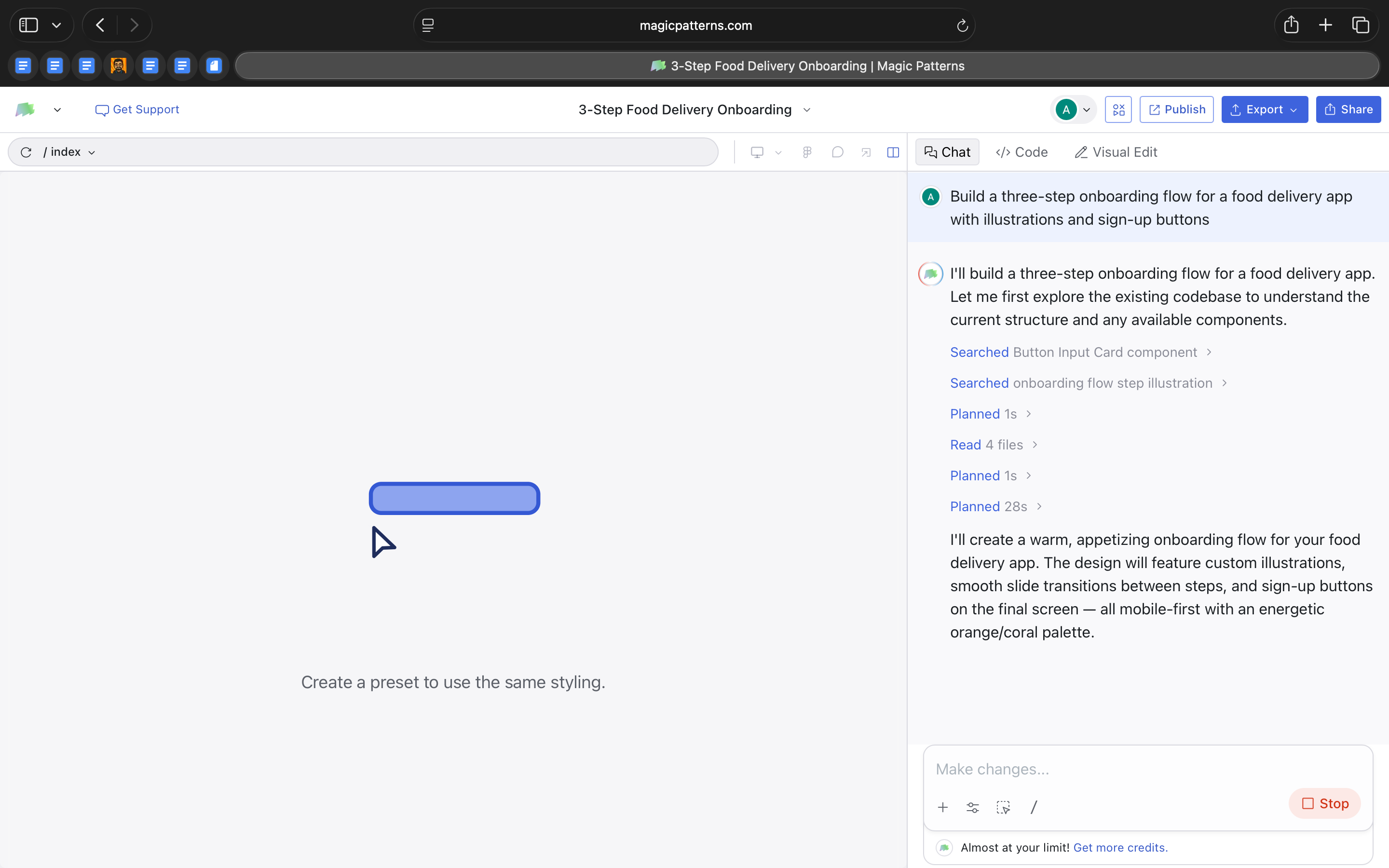
It generated multiple component files, added step logic, and included motion. When I asked it to modernize the flow, it rewrote large parts of the code rather than simply restyling the interface.
From an AI-in-design perspective, that is the real shift.
The interface is treated as a regeneratable system. Layout can remain stable while style evolves. Features can be rewritten at scale rather than adjusted element by element.
Magic Patterns is not just helping design screens faster. It’s experimenting with design as something that can be programmatically explored and re-authored inside the codebase itself.
Where it works well
Where Magic Patterns works well is when you want to move from idea to something tangible without spending hours setting up the basics.
When I built the marketing dashboard, I didn’t have to think about grid systems, table layouts, card structures, or responsive behavior. The foundation was already handled. That made it easy to focus on whether the dashboard made sense rather than how to assemble it.
It’s particularly strong for feature prototyping.
The three-step onboarding flow is a good example. Instead of manually designing each screen and thinking through transitions, I could generate the full flow and then decide whether the sequence, tone, and hierarchy worked. It gave me something real to react to.
It also works well when you want to explore visual direction without committing too early. The fact that the dashboard came with multiple stylistic options made it easy to compare tones quickly. I wasn’t tweaking colors for hours. I was evaluating different design personalities side by side.
Another place it works well is internal demos. Because everything runs as an actual frontend, you can share a working version instead of static screens. That changes the conversation. People respond differently to something interactive, even if it’s rough.
And finally, it’s useful when you want to test the “feel” of a feature. The modernization pass on the onboarding flow showed how quickly the tone of a product can shift. Instead of refining individual elements, you can experiment with the overall mood of the interface in one go.
In short, it works well when the goal is progress, not polish.
It helps you answer:
Does this feature make sense?
Does this direction feel right?
Is this worth investing in further?
That’s where I feel it’s the strongest.
Where it falls short
The more time I spent with Magic Patterns, I realized that it’s very good at generating structure and visual direction quickly. But once I moved past the first version, I found myself wanting more depth.
The dashboard variations were distinct, but they were built from familiar patterns. Clean cards, gradients, glass effects, modern typography. The tool can explore style well, but it does not push into unexpected territory. If you are looking for a deeply differentiated design language, that still requires human intervention.
The onboarding flow highlighted something similar. When I asked it to modernize the interface, the visual tone shifted noticeably. There was more depth, more motion, more layering. But the underlying experience remained largely the same. The tool refined how it looked, not how it worked.
That distinction matters.
Magic Patterns accelerates execution. It does not question assumptions. It will build a three-step onboarding flow if you ask for one, but it will not challenge whether three steps are necessary or whether the flow itself could be simplified.
I also felt the limits around system control. While edits update real React files, there is no strong sense of a central design language being managed across the entire project. Changes happen at the component level. For quick feature work that is fine. For larger, brand-driven products, it could become harder to maintain coherence.
And when regeneration happens at scale, control becomes looser. Large rewrites are powerful, but they can feel heavy. If you want precise refinement instead of broad reinterpretation, the workflow is less accommodating.
Magic Patterns is strong at getting you to a structured, working version quickly. It’s less strong at deep interaction design, long-term system governance, and nuanced originality.
What makes it different
What makes Magic Patterns different is simple.
Most AI design tools give you screens.
Magic Patterns gives you frontend code.
When I built the dashboard and onboarding flow, I was not working with mockups. I was working with actual React components. They were structured, editable, and ready to extend.
That changes how you think about the tool.
If you use something like Uizard or other rapid prototyping tools, you get visual layouts that still need to be rebuilt in code. Magic Patterns skips that rebuild step. The first version already lives in React.
At the same time, it is not trying to build your entire app. It does not handle backend logic or full product infrastructure. It stays focused on the interface layer. That makes its scope clear.
Compared to Figma, the difference is also straightforward. Figma is about precision, craft, and design systems. Magic Patterns is about getting to a working structure quickly. You can refine it later, but the starting point is already implementation-ready.
What stood out to me is that everything happens in one place. I could prompt a feature, tweak layout in a visual panel, open the code, and publish a live version.
It sits somewhere between a design tool and a code editor.
My take
After spending time with Magic Patterns, I don’t see it as a replacement for design tools.
I see it as a shift in how the first version of a product can be created.
What stayed with me is how quickly I could move from an idea to something real. Not a mockup. Not a concept. A working frontend structure. That changes the starting point of product conversations.
At the same time, it does not remove the need for design thinking. It will generate what you ask for, but it will not challenge your assumptions. The judgment still has to come from you.
For me, Magic Patterns feels strongest as a thinking tool.
It is useful when you want to explore shape and structure quickly. When you want to test whether a feature makes sense. When you want something tangible to react to.
So, I do not see Magic Patterns as a design replacement. I see it as a fast starting layer. A way to get to a structured version quickly so you can react, refine, and decide what is worth keeping.
For small teams or early-stage ideas, that is really helpful. For deeper product creation, it’s a starting point, not the finish line.
In the Spotlight
Recommended watch: AI Browsers | Where Do Work Well And What Can’t They Do Yet
In this episode of Mindset Spelled with AI, David and Phillip unpack what’s actually new about AI browsers. The key idea aligns closely with this week’s theme: these tools are not just summarizing pages, they’re layering agentic behavior directly into the web itself. The browser becomes a surface where tasks can be executed, not just researched.
They also question whether “AI browser” is even the right term, hinting that this may be a transitional category before deeper assistant layers take over.
That’s the promise of the web AI browser or AI browser is that it is like an agentic mode where it lives on the web and can do the stuff that you would normally do in the chatbot AI chatbot but it’s all integrated and because there is this web browser layer it adds on features you would not otherwise be able to do in this UI which is the normal chatbot.
– David • ~4:09
This Week in AI
A quick roundup of stories shaping how AI and AI agents are evolving across industries
Moonshot AI launched Kimi Claw Native (OpenClaw) on Kimi.com, introducing 5,000+ community-built skills and 40GB of cloud storage, signaling a stronger push toward customizable, skill-based AI ecosystems.
Anthropic released Claude 4.6 Sonnet with a 1 million token context window, expanding its ability to handle complex coding tasks, long documents, and deeper developer workflows.
Alibaba’s Qwen 3.5 advances its open model family with stronger reasoning, coding, and multimodal capabilities, reinforcing how quickly frontier-level AI is becoming more accessible.
AI Out of Office

AI Fynds
A curated mix of AI tools that make work more efficient and creativity more accessible.
Studioify → An AI studio that generates polished visual content from simple prompts in minutes.
IMAI Studio → An AI content platform for quickly creating marketing and branded visuals.
AI Video Generator → A tool that turns prompts and media into ready-to-share AI-generated videos.
Closing Notes
That’s it for this edition of AI Fyndings.
With Strawberry pushing the browser from assistance to execution, Shipper collapsing idea to live product, and Magic Patterns turning interface prompts into real frontend code, this week underscored a clear direction. AI is no longer just helping us think. It’s beginning to run parts of the workflow itself. Less about generating drafts. More about operational layers.
Thanks for reading. See you next week with more tools and patterns shaping how AI transforms business, product, and design.
With love,
Elena Gracia
AI Marketer, Fynd